Designer language - Research / Improve Spotify's UX

I'm a full-stack developer
Overview:
1- Introduction
2- Problem statement
3- User & Audience
4- Roles & Responsibilities
5- Scope & Constraints
6- What happened (process & what I did)
7- Conclusion
Design is not just what it looks like and feels like. Design is how it works.
Steve Jobs
1- Introduction
UX research is the systematic investigation of users in order to gather insights that will inform the design process with the help of various user research techniques to set out to understand your users' needs behaviors attitudes and pain points. UX research is all about gathering and interpreting data and feedback you do this by observing:
- users conduct interviews
- running usability tests...
Spotify is a digital distribution platform that allows almost instantaneous listening to music files. This music desktop app is where our design case study will be discussing in this blog post which considers the purpose of the UX research and why it's important.

2- Problem statement
After reviewing the business goals at the end of last quarter, the Research team wants to identify if we have an opportunity to make users stream more content. They have identified a challenge that they think is worth exploring: “Improve how Spotify users find music to listen to.”
The following document is a student journey map, that shows how it can be hard to find a tempo instead of a song title during the search on the app. The exclamation marks show the pain points where the user must struggle to find his desired result.
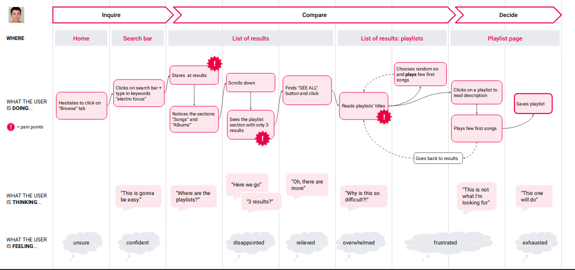
From this map, we can extract the points that need improvement, the following are some of them:
- Browsing database time to find the desired result can be less and more efficient.
- User search can be more refined and more guided to enable users to find tracks and playlists more easily.
- Improve tracks and playlist classification in order to match the users' search.
Eventually, users' search experience on the Spotify desktop app is the main axis that we will focus on, in order to make it more efficient in the next step.
3- User & Audience
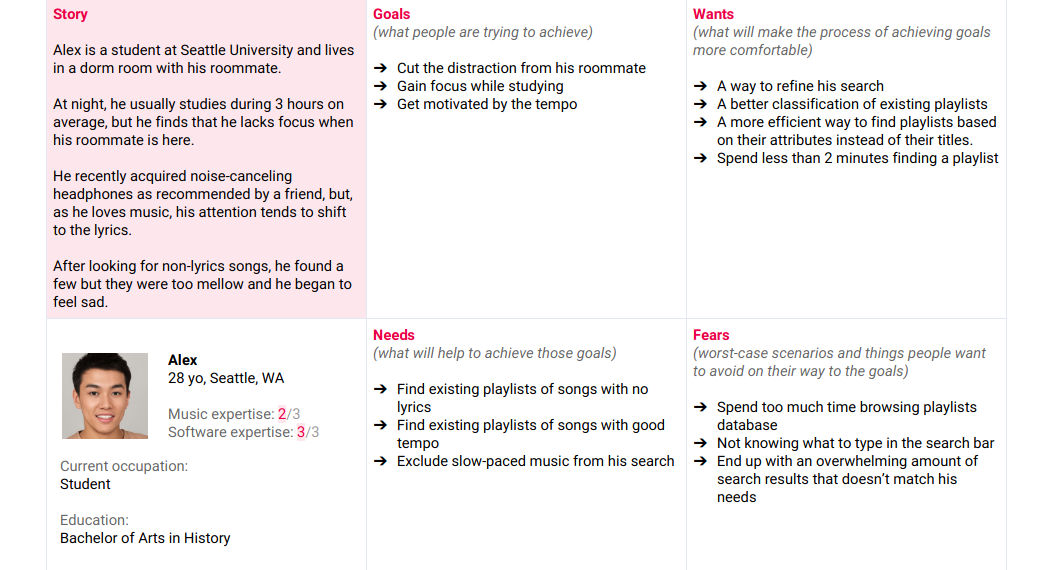
As it's mention in the above section our case study is a student that we will analyze his experience on the Spotify desktop app. Alex is a loyal Spotify user like many other students, that music helps him to focus while he studying. After spending his day in the university, Alex spend usually 3 hours in the dorm room to review his lessons.
With the noise produced by his roommate, Alex finds in music an escape to avoid that noise and stay focus on what he trying to study.
4- Roles & Responsibilities
Currently, I'm a software engineer student specialize in full-stack web development.
Designer language is a 3 parts project: research, prototype, and validate. It's an initiation to learn how UX designers work by solving UX problems and writing a UX case study that explains the discoveries/solutions.
During this project, we will focus on a particular mindset, which has been adopted in big companies such as Apple, IBM, Intuit, and more. It is called Design Thinking.
5- Scope & Constraints
The scope of this project is to enable users to improve their personalized music search results without using only titles while exploring more music databases content. And eventually improving the UX on the Spotify desktop app.
As the case study in this project based on the Spotify desktop app, we will stick to Spotify Guidelines & Assets.
6- What happened (process & what I did)
During this phase we should find as max as possible opportunities to improve the UX design and choosing the most convenient and realistic one, among these ideas the following list:
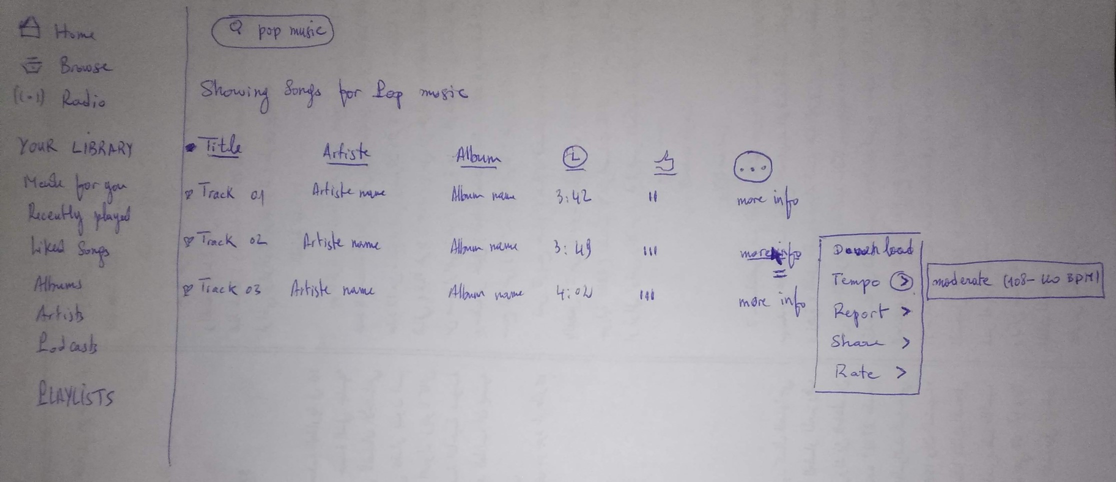
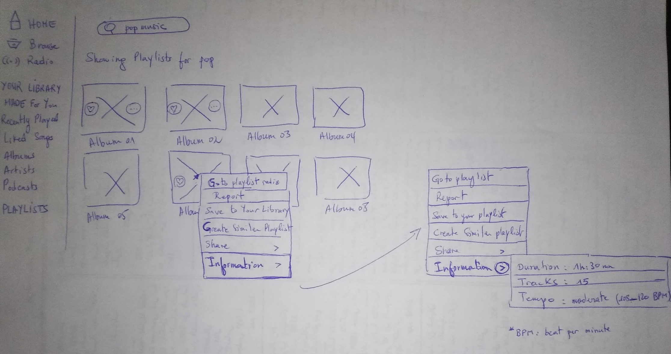
- Add extra information that will include "the tempo" property.
- Add a filter that allows ordering the tracks and the playlists from the fastest "tempo" to the slowest and vice versa.
- Play chorus while hovering the song's title to enable users to discover "the tempo" of the track.
- Allows users to add a number from 1 to 10 that indicates "the tempo" level from slowest to fastest while searching songs titles.
According to Alex's journey map, we ended by identifying the solution by adding more information that includes "the tempo" track/playlist.
We chose the above idea because it renders the songs and playlists in a more efficient way and allows the users to save time while they search a given track's tempo and avoid playing the songs to discover the tempo.
Tracks' search improvement:
Playlists' search improvement:
7- Conclusion
As a result of the design language project 1st part, I learned that when designing a UX design improvement of a product, that we can always identify more easiest way to use applications and solutions.


